Accelerating a Signal Processing Algorithm with TornadoVM: The Scenario
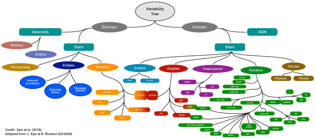
Gaia is a mission of the European Space Agency (ESA) whose goal is to create a precise survey of our galaxy by surveying more than 1.8 billion objects. The Gaia spacecraft was launched in 2013 and orbits around the Sun at the Lagrange 2 point, 1.5 million kilometers from our planet. It embarks instruments that measure the position, distances, movement, brightness, and spectra of each surveyed object (stars, galaxies, …) at an average frequency of 14 observations per year. The position of the brightest objects can be measured within a precision of 24 micro-arcseconds, i.e. one 150 millionth of a degree. Gaia can, in addition, capture objects whose brightness scales down to a magnitude of 20, which corresponds to 400,000 times fainter than what the naked eye can see.Gaia produces a huge volume of data that is transferred and processed on Earth by the Gaia Data Processing and Analysis Consortium (DPAC), divided into nine coordination units (CU), each in charge of a particular aspect of the data analysis. The University of Geneva, partner in AERO, is responsible for the 7th coordination unit in charge of the study of variable stellar objects, i.e. those whose brightness from a particular observation point changes over time. Many categories of variable stars exist, as shown on the graph below, and deciding whether each star belongs or not to one of those classes is a computationally intensive data analysis process.
For the third data release of the Gaia catalog, which summarizes the observations between July 2014 and May 2017, CU7 analyzed a selection of 12.4 million stellar objects. Each object, called a source, was measured by the instruments with a median of 40 to 44 observations. The data processing for the variability studies only required more than 534 days of computation (spread on a cluster of 135 machines).
The upcoming data release is expected to include more sources over an observation period up to January 2020. Each source shall be surveyed on average 77 times and more data, including spectral data, shall be analyzed. This means that the data processing load is expected to be much higher than in DR3. Optimization of the performance of algorithms is of uttermost importance since it will be the limiting factor when it comes to decide what can or cannot be analyzed.
In that context, the use of accelerators, including GPUs seems necessary. Even if the algorithms that are part of the processing pipeline are not trivial to parallelize, the number of independent data series to process lets us envision several optimization opportunities. That’s with those considerations in mind that University of Geneva and Sednai joined AERO to work on pilots, i.e. demonstrators to evaluate and showcase the performance of the European Processor and of the software stack adapted by the project. As the Gaia processing pipeline is implemented in Java, TornadoVM seems like an ideal candidate framework to parallelize time-consuming algorithms with GPUs.
In this article, we shall first explain how data is processed. Then, we will detail one algorithm, Period Search, that has been our first candidate for GPU development. We will then explain the process we followed to adapt it to be executed on GPU, including successes and failures.
The Gaia CU7 Data Processing Pipeline
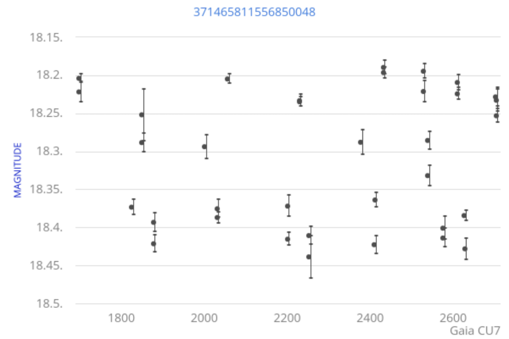
The data acquired by the Gaia spacecraft passes through several transformation steps before it reaches CU7 for variability processing. Those steps, which include filtering, calibration, noise reduction and other data preparation algorithms are not relevant here. From the variability studies point of view, we receive photometric time series, i.e. sequences of observation of the same source, realized at different times, each observation reporting the brightness of that source as seen from the instruments and an associated measurement error. The figure below graphically represents one such photometric time series, the X axis representing the dates of observation, expressed in days since the start of the mission, and the Y axis the brightness expressed in apparent magnitude of the source. Data about the position and the movement of each source is also available if the analysis requires it.
In the first step of the processing pipeline, a set of descriptive statistics metrics are calculated for each source, which then allows to exclude some objects from the rest of the analysis by assessing their chance to be variable or constant. Then, the selected sources, the variable candidates, are characterized, which means that we evaluate some general characteristics on their variability pattern such as the predominant frequencies in the signal we acquired for them. The Period Search algorithm we are optimizing, which will be described below, belongs to the characterization step.
At the end of the characterization phase, each source has enough associated metrics so that we can exclude more sources and categorize the remaining sources using supervised or unsupervised classification algorithms. At the end of this phase, each source may be associated to one of the classes of the variability tree shown below. Several sub-categories (Compact Companions, Cepheids, RR-Lyrae, Microlensing, Eclipsing binaries, …) are then studied specifically assuming we know their categories to get more precisions on the phenomena that lead to brightness variation.
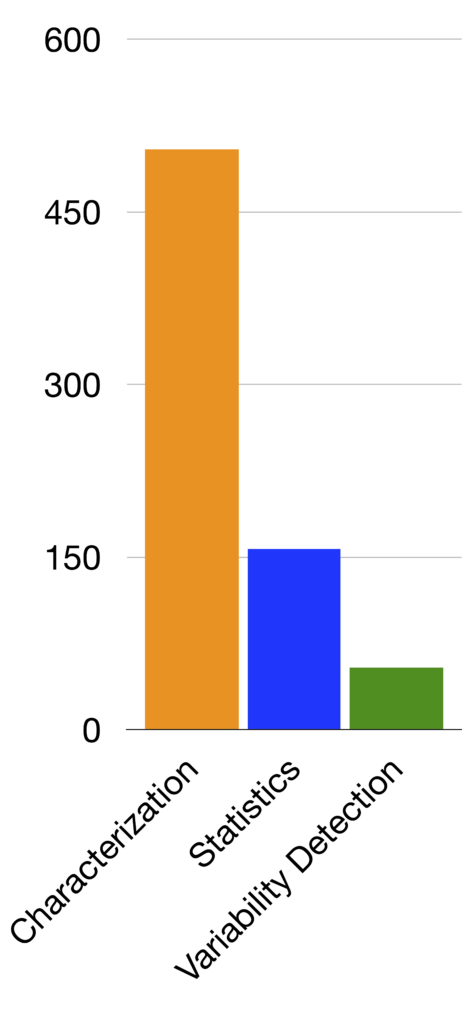
The histograms below represent the total computation time for the different modules of the processing pipeline when computing the whole DR3 catalog. On the left graph, the gray bars are only relevant for specific types of sources. The right graph focuses on the three main core tasks: characterization that includes Period Search, Statistics and Variability detection. These figures show that among the core tasks characterization, hence Period Search, is the most time-consuming process, but also that the specific studies are the most time-consuming tasks by far.
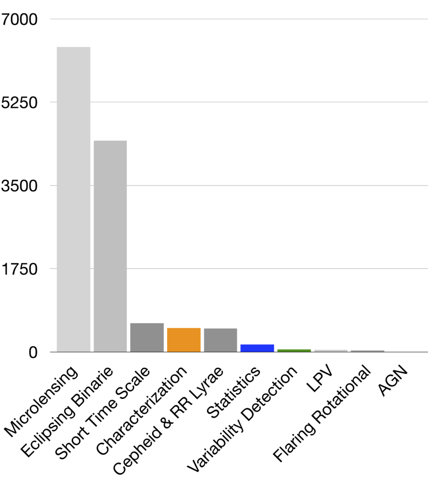
However, the total time spent on some of these studies comes from a too wide selectivity. Each of these algorithms are naturally computationally intensive because they shall push the analysis beyond general description. They should, however, filter out the objects they analyze, which should only be the reasonable candidates.
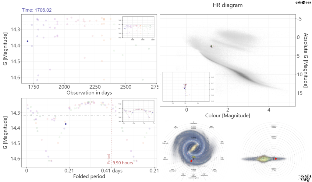
Source classification is therefore an important task and it directly depends on the results of period recovery from a sparse Gaia signal. As with every classification algorithm, some candidates are certain matches, and some others are more ambiguous, close to the border between two categories or more. For all those sources, the ESA citizen science project GaiaVari involves the community to analyze the data, discuss and decide on a category on a carefully selected subset of Gaia data and point out problems with period recovery as well. The Figure below represents an example of the data citizens are working on. We encourage readers to check GaiaVari by themselves.
The top right graph is called the HR diagram and associates the color of each object, which depends on its temperature, and its luminosity. It is a fundamental diagram in stellar astrophysics to classify stars and other objects. The top-left graph is the light curve, i.e. the visual representation of the time series mentioned above. From that sequence, we extract a preeminent fundamental period and fold the time series around that period, which consists in regrouping the measurements in intervals of the length of the identified period. This gives a visual representation easier to analyze. And the bottom right locates the object in the galaxy.
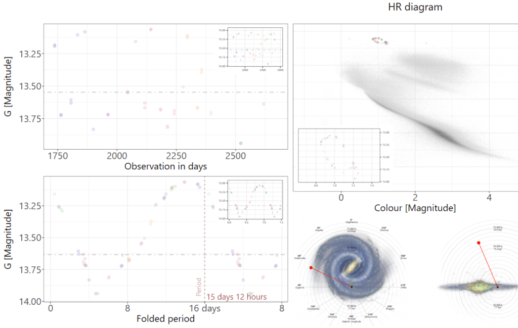
This process also relies on the proper identification of the principal period and when that algorithm gives wrong results, the resulting visualization can be ambiguous or misleading, like the one shown below on which the folded light curve seems to be the composition of two light curves by halving the real period of this Eclipsing Binary system.
The results of Period Search are therefore fundamental for the identification of the proper stellar object category, but it also has a non-negligible computation cost, as mentioned above. First, there is a natural interest in optimizing the implementation speed. But besides, for the upcoming data releases, more sources are to be analyzed with longer time series. The graph below represents a plot of the time taken by Period Search in function of the length of the time series. The evolution seems to follow multiple trends, but the general behavior is a clear increase of the computation time with the time series length. Adding 50 ms to the processing of each time series represents an additional 166 hours of computation for 12 millions time series.
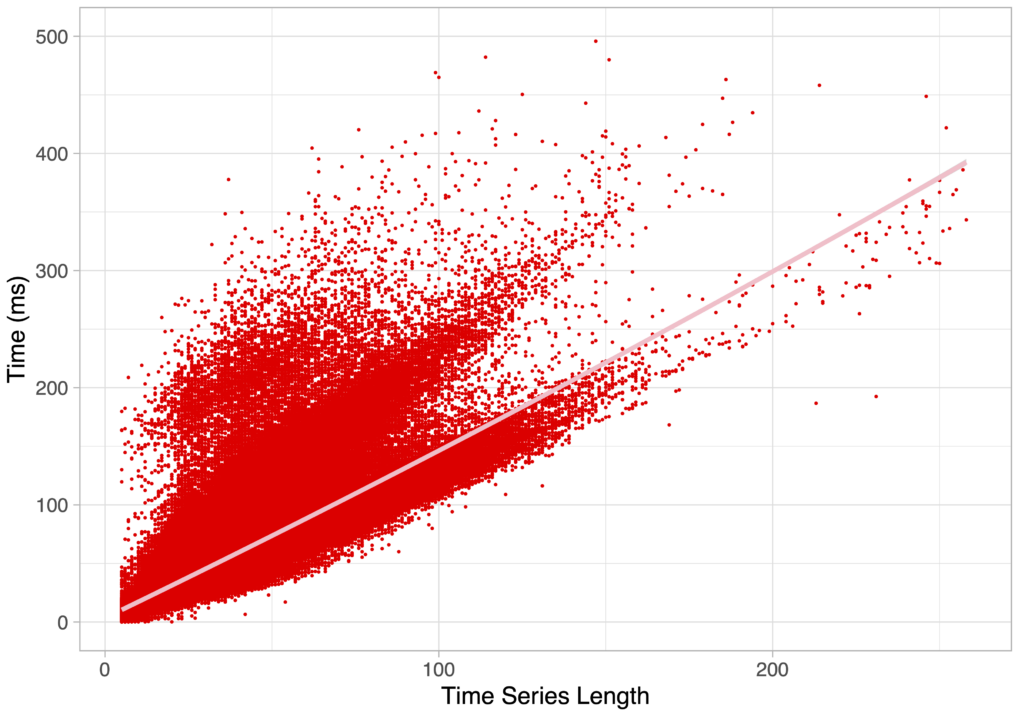
The total execution time of characterization is therefore expected to increase substantially. Secondly, a more efficient algorithm would allow us to do the same analysis in different photometric bands, including red and blue bands, characterizing the sources better and leading to an easier and more accurate classification process for machines and for humans. Not to mention that more complex algorithms could also be run as a replacement or as a complement to the state-of-the-art algorithm that we will introduce next.
Least Squares Period Search
The Period Search algorithm is like a Fourier transform, passing from the time domain to the frequency domain. Those algorithms, unlike Fourier transforms, are meant to be executed on irregularly sampled time series. The Least square is a fitting method based on the minimization of the squared differences between the observed data and a model based on the sum of weighted sines and cosines:
$$x(t) = c + c_1 \cdot \cos(2 \cdot \pi \cdot f \cdot t) + c_2 \cdot \sin(2 \cdot \pi \cdot f \cdot t)$$
In practice, the algorithm implementing this method takes a time series and produces a periodogram over a set of frequencies. The set of frequencies shall cover the period of observation and be sampled at a rate that is expected to be higher than the signal’s Nyquist rate, since the data is irregularly sampled. In practice, for the data release 3, this meant roughly 300,000 frequencies, and that number is doubled in data release 4 since the width of the peaks is reduced by a factor of two. The algorithm then calculates an amplitude for every frequency f among these 600,000 frequencies by computing the following sums over a time series composed of N observations $(t_k, u_k, e_k)_{k=1…N} $ :
$$S = \sum_{k=0}^N \sin(2 \cdot \pi \cdot f \cdot t_k)$$
$$C = \sum_{k=0}^N \cos(2 \cdot \pi \cdot f \cdot t_k)$$
$$S = \sum_{k=0}^N \sin^2(2 \cdot \pi \cdot f \cdot t_k)$$
$$CC = \sum_{k=0}^N \cos^2(2 \cdot \pi \cdot f \cdot t_k)$$
$$SX = \sum_{k=0}^N \sin(2 \cdot \pi \cdot f \cdot t_k)\dot u_k$$
$$CX = \sum_{k=0}^N \cos(2 \cdot \pi \cdot f \cdot t_k)\cdot u_k$$
$$SC = \sum_{k=0}^N \cos(2 \cdot \pi \cdot f \cdot t_k) \cdot \sin(2 \cdot \pi \cdot f \cdot t_k)$$
Then those sums are combined to provide the amplitude
$$ d = N \cdot ( CC \cdot SS – SC^2 ) – C^2 \cdot SS – S^2 \cdot CC + 2 \cdot S \cdot C \cdot SC $$
$$ b = C \cdot S_X – S \cdot C_X $$
$$ c_1 = N \cdot (CX \cdot SS – SX \cdot SC) + S \cdot b $$
$$ c_2 = N \cdot (SX \cdot CC – CX \cdot SC ) – C \cdot b $$
$$ amplitude = \frac{(c_1 \cdot CX + c_2 \cdot SX)}{d} $$
The resulting set of amplitudes compose the periodogram, or frequencygram, as represented on the Figure below.
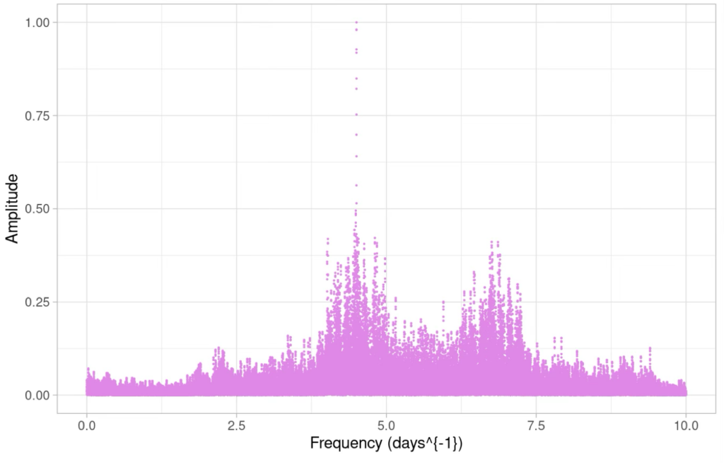
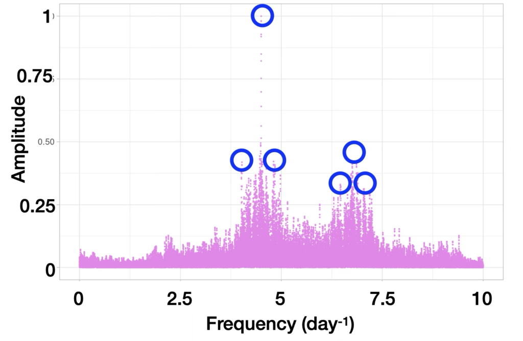
Several results can be obtained from this analysis. For our purpose, for example, the principal frequencies composing the observed signals are the ones whose amplitude is maximal.
Computation-wise, this algorithm requires mostly to compute 7 sums of N sines and cosines. Its complexity is therefore linear in the number of observations, which leads to a global complexity for the whole periodogram calculation being proportional to the number of frequencies multiplied by the time series length. The computational stress of this step comes from the size of the problem and from the cost of the trigonometric functions themselves.
Once the periodogram is calculated, the subsequent steps of the algorithm consist in
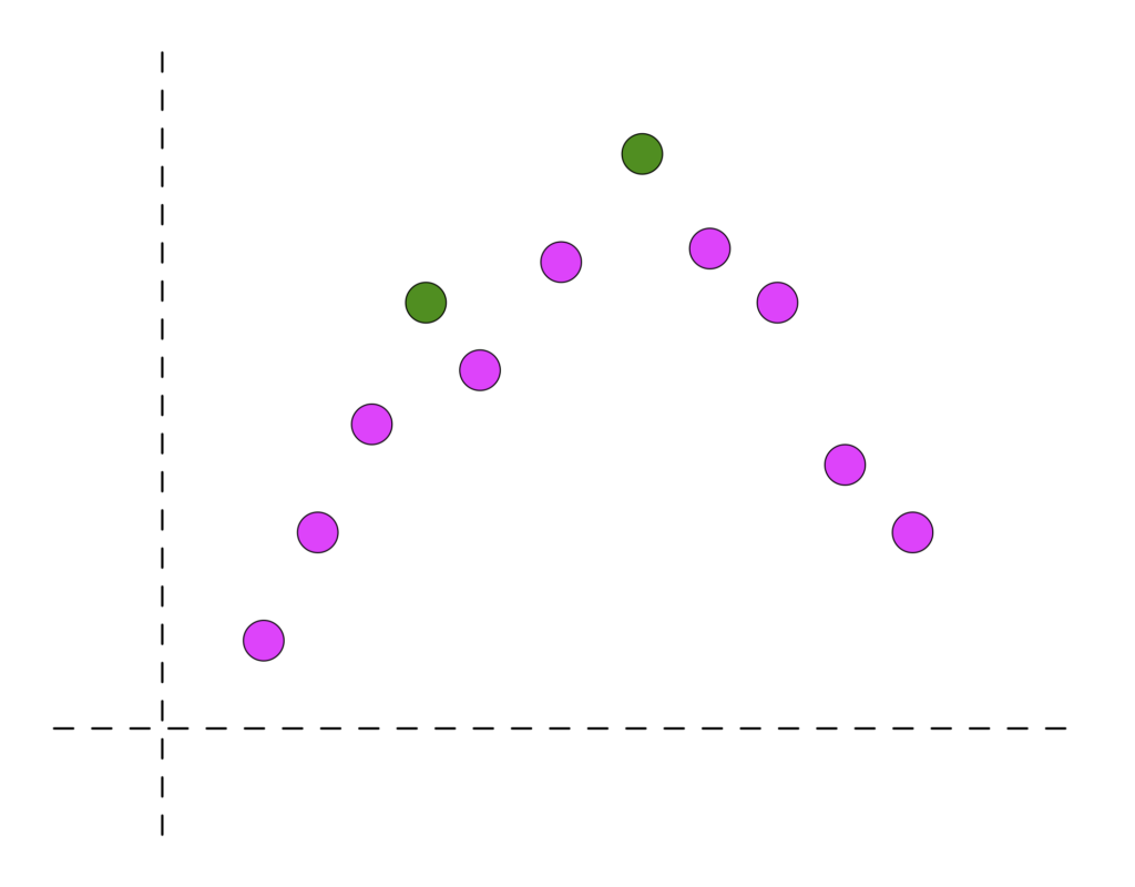
- Filter out frequencies whose amplitudes are not local maxima. In other words, we want to make sure that the amplitude of any candidate frequency is higher than its predecessor’s and its successor’s. If the Figure below represents a zoomed area of a periodogram, only the green colored points will be selected since they are the only ones whose predecessor and successor both have smaller amplitudes.
- Selecting the K best frequencies among the set. The figure below represents such an example with K = 6. This is a selection problem. Algorithms like Quick Select have a linear average complexity, degrading to quadratic in the worst case.
- Optionally, refine the algorithm in the vicinity of the selected frequencies, which means examining frequencies close to the identified maxima with a much higher resolution. The graphic below shows on the left the initial frequencies sampling and on the right the refinement process around one frequency identified as one of the K maxima.

- Calculate a few global statistics and metrics over the whole frequencygram.
Accelerating PeriodSearch
When it comes to performance improvement, each step of the previous method can be accelerated by selecting the right algorithms and data structures. For example, the selection of the maxima can rely on a heap structure with a logarithmic complexity for insertion and for selection but has a cost in memory.
However, there is no straightforward method to improve performance of non-trivial algorithms. In the next post of this series we will look at the steps we took, with the help of TornadoVM, to achieve a fair speedup on Period Search and frequencygrams production.
